The rooms for the travel start-up have been individually tailored to each of the 3 basic parts of the company - call center, IT and management, and are the work of the Horalík Atelier.
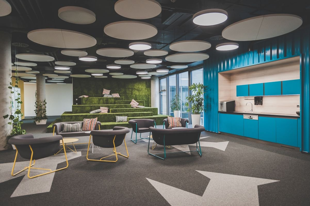
Kiwi.com is typical for its unsurpassable commitment and so a big part of it has been devoted to relaxation and entertainment features, which include relaxation rooms, swing meeting corners, grass sitting areas with views of the sunset, and fitness or sauna facility with massage. Generous room was designed for creative IT, namely as a semi-open space made of individual semi-closed “boxes”, where the spatial concept deliberately invokes the slightly jumbled work atmosphere of the original headquarters of the interwar villa. Management offices are more frugal, but conceptually close to IT.
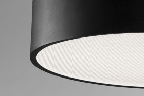
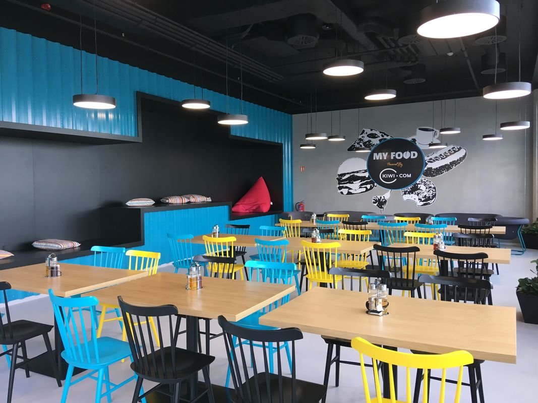
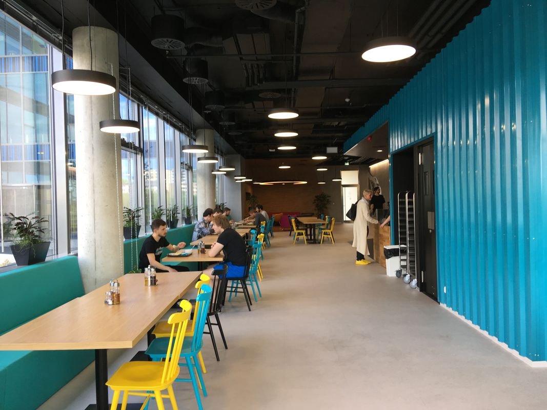
Both linear and circular luminaires were designed for the space to adequately highlight the interior and overall atmosphere. But the calculation also took into account the combination of luminaires of various diameters, lengths and light flows.


